
Responsive Web Design Agency Berlin
Responsive Web Design
From Berlin.
We design and develop responsive websites that work convincingly on smartphones, tablets and desktop screens, with layouts, typography, navigation and interactions that show the company's standard on every device and guide visitors toward action.
Responsive Design
More Than a Flexible Layout.
A large share of digital usage now happens on smartphones. Yet many websites are still designed for desktop first and then squeezed onto smaller screens. The result is small typography, hard-to-reach buttons, unclear navigation, slow loading times and contact paths that do not convince on mobile.
Responsive design at BxW does not mean that a layout simply gets smaller. Typography, navigation, touch areas, image sizes and content structures are considered from the beginning for different screen sizes. This creates websites that feel as refined on mobile as they do on desktop and make the path to inquiry, product or contact clear on every device.
Portfolio
Selected
Responsive Websites.

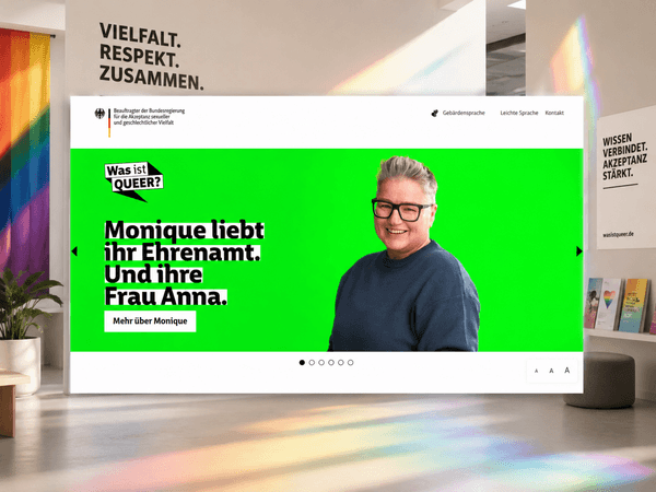
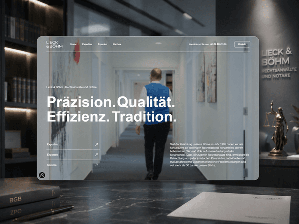
Typical Projects
What We Design Responsive Websites For.
Responsive web design matters in every web project. The real question is whether mobile use is genuinely considered or only technically supported.
Responsive Website Design
New WebsiteMobileDesktop
For companies that want a new website that feels equally convincing and usable on smartphone, tablet and desktop from the beginning.
Mobile Optimization
MobileOptimizationSpeed
For websites that work on desktop but lose visitors on smartphones because usability, speed or readability are not strong enough.
Responsive Relaunch
For existing websites that should be relaunched with consistent responsive design, better mobile performance and contemporary touch interactions.
Mobile-First Web Design
Mobile-FirstAudiencePriority
For companies whose audiences are primarily mobile and where the smartphone experience should guide the design, not the other way around.
Responsive E-Commerce
For shops where product presentation, filters, cart and checkout need to work as convincingly on mobile as they do on desktop.
Tablet and Touch Optimization
TabletTouchPresentation
For websites used on tablets in meetings, at events or in sales, where touch control, presentation and orientation matter particularly.
Quality Standard
What Responsive Design Needs.
Responsive design is not proven by a layout that technically adapts. It is proven when the website is easy to use, readable and convincing on every device.
Services
From Screen Size to Experience.
Responsive web design at BxW means that concept, design and development pursue the same goal on every device: a website that convinces and works.
The Right Partner
Why BxW.
Responsive design is often treated as a technical obligation. For us, it is a design task: how does a website show the company's ambition on every screen?
Design for Every Screen
We design layouts, typography and interactions so the mobile website does not feel like a compromise, but like a refined experience of its own.
Sensitivity for Touch
Menus, buttons, forms, sliders and interactive elements receive the same care for touch as for mouse and keyboard.
Performance as Part of Design
Loading speed and Core Web Vitals on mobile devices are not just technical metrics. They are part of the user experience, so we optimize both together.
Testing on Real Devices
We do not rely only on simulators. Display, touch behavior and performance are reviewed on real smartphones, tablets and browsers.
Responsive Over Time
New devices, screen sizes and browser standards keep appearing. We support responsive websites so they continue to work well as requirements change.
Mobile Optimization
Your Website Does Not Work Well on Mobile?
We analyze where your website loses visitors on mobile devices and define focused improvements, from touch optimization and loading speed to mobile user guidance.
Request a Mobile ReviewRelated Services
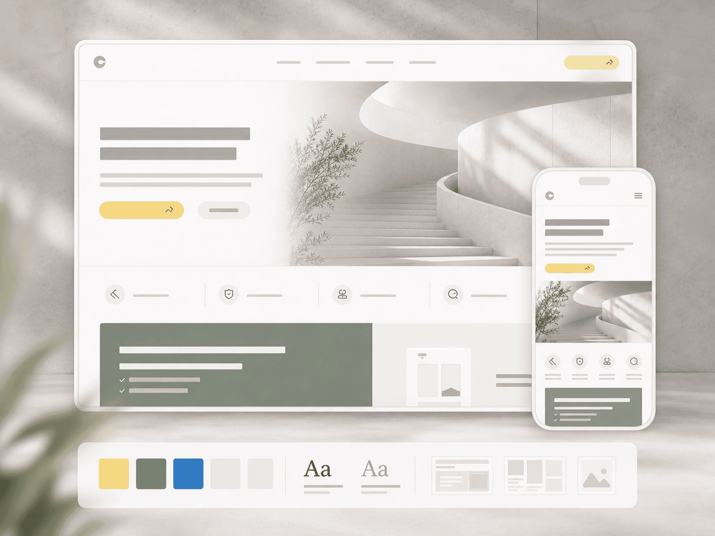
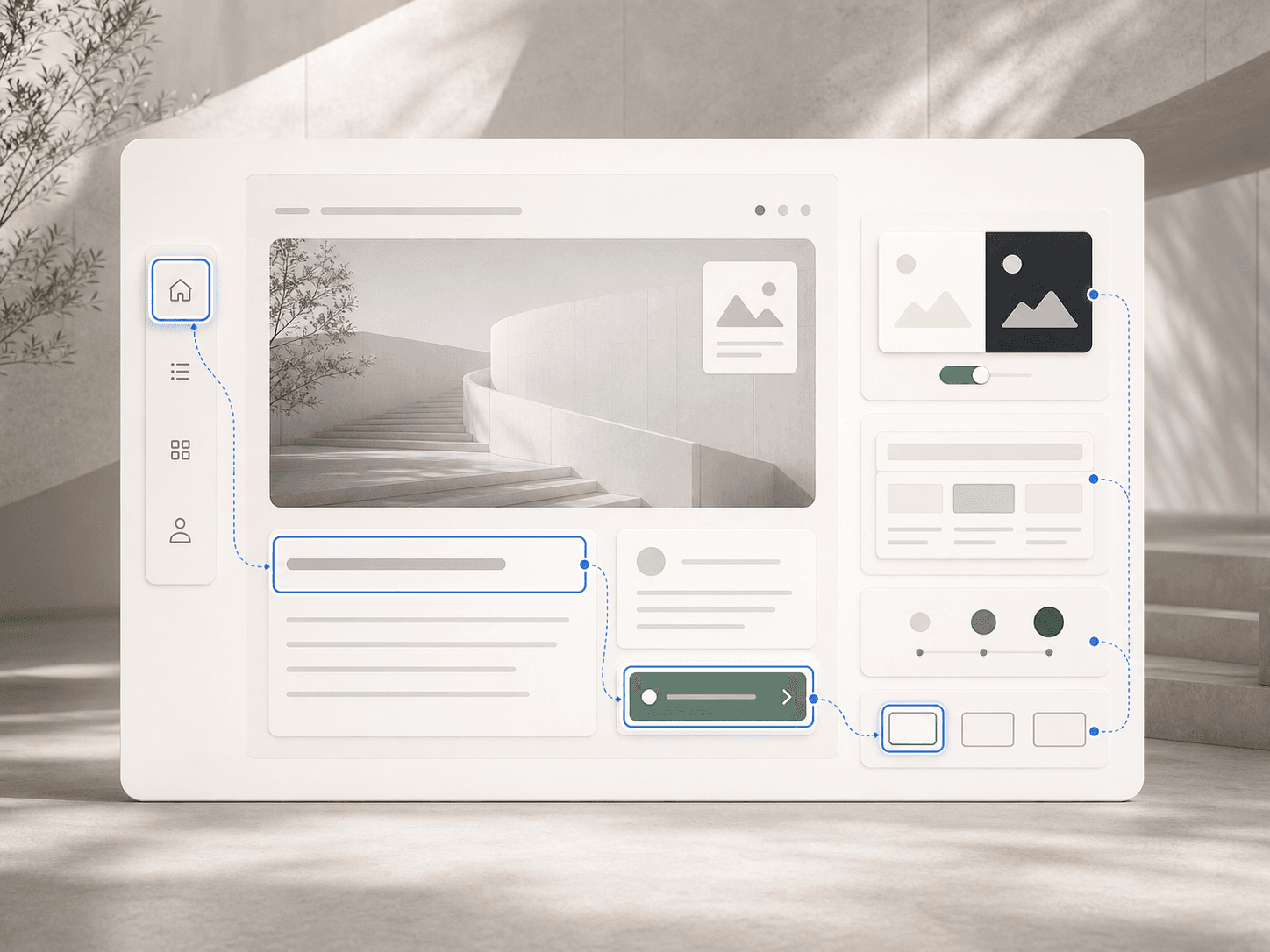
Responsive Quality in Context.
Responsive quality grows from the combination of design, performance, accessibility and clean frontend development.

Key Questions
Before the Project.
What is responsive web design?
Responsive web design means a website is designed and developed to respond to different screen sizes, from smartphones and tablets to large desktop monitors. It affects layouts, typography, navigation, images, interactions and forms. The goal is that visitors experience the same quality and usability on every device.
Why is responsive design important?
Responsive design matters because mobile use, visibility and conversion are closely connected. Websites that perform poorly on mobile lose attention, trust and inquiries. Google uses the mobile version of a website as a central basis for indexing and ranking, and users expect a professional website to work convincingly on every device.
What does mobile-first design mean?
Mobile-first means the design starts with the mobile view and is then extended for larger screens. Instead of shrinking a desktop version, the mobile experience becomes the starting point. This usually leads to clearer hierarchy, more focused content and better user guidance.
Can an existing website be made responsive?
In many cases, yes. CSS, layout structure, navigation, images and touch interactions can be improved after launch. The effort depends on how the website is built. If the foundation is outdated or strongly desktop-only, a responsive relaunch can be the more sensible path.
How does responsive design affect SEO?
Google works with mobile-first indexing: the mobile version is a central basis for how content is understood, indexed and evaluated. Responsive design is not enough for SEO on its own, but it helps ensure that content, internal links, structure, Core Web Vitals and user experience also work cleanly on mobile.
What does responsive web design cost?
Responsive design is standard in professional website projects, not an isolated add-on. Effort depends on overall scope: number of pages, content types, interactions, technical foundation and the quality of the existing website. For existing sites, we first clarify whether targeted mobile optimization is enough or whether a responsive relaunch is more sensible.
How is responsive design tested?
Through a combination of browser tools, emulators and real devices. We test on current iPhones, Android smartphones, iPads and desktop browsers, reviewing layout, touch interactions, forms, navigation, loading speed and the overall experience.
What is the difference between responsive and adaptive design?
Responsive design adapts flexibly to screen widths using grids, relative units and breakpoints. Adaptive design relies more on fixed layouts for defined device sizes. In practice, responsive design is usually easier to maintain and better prepared for today's variety of devices.
Do websites still need a separate mobile version?
Usually not. Separate mobile websites are outdated in most cases and weaker for SEO, maintenance and brand consistency. A responsive website uses one technical and editorial foundation while adapting presentation and interaction to the device.
Will responsive design remain intact with new content?
Yes, if the CMS, templates and components are built properly. New content, pages and media then fit into the responsive system. Editorial teams still need to understand how images, tables, embeds and content blocks work on mobile.
Discuss a Responsive Project.
Whether it is a new website, relaunch or mobile optimization, the best starting point is a clear conversation about audiences, devices and the ambition for a website that convinces on every screen.
Start a Project